
UMI KITCHEN
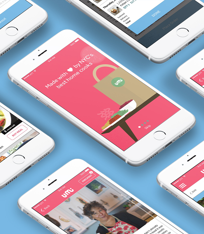
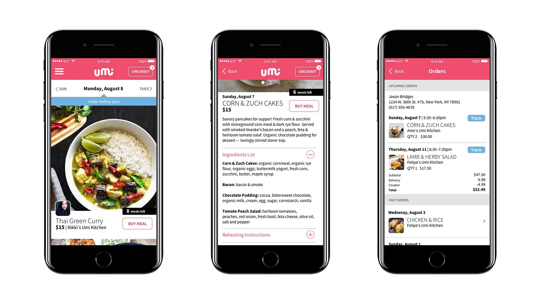
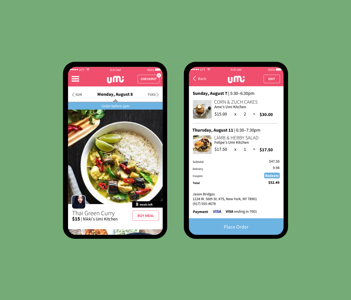
Umi Kitchen is an iOS food delivery app that allows home cooks a way to market their recipes and share personal stories through cooking while providing consumers with a home-cooked meal as easily as they could order take-out.
UMI KITCHEN
Umi Kitchen is an iOS food delivery app that allows home cooks a way to market their recipes and share personal stories through cooking while providing consumers with a home-cooked meal as easily as they could order take-out.
THE PROBLEM
Umi Kitchen already had a presence in Brooklyn. Looking to scale the company, they wanted to do a launch in Manhattan and contracted me to refresh the user interface of their mobile app.
ASSESSING THE CURRENT INTERFACE
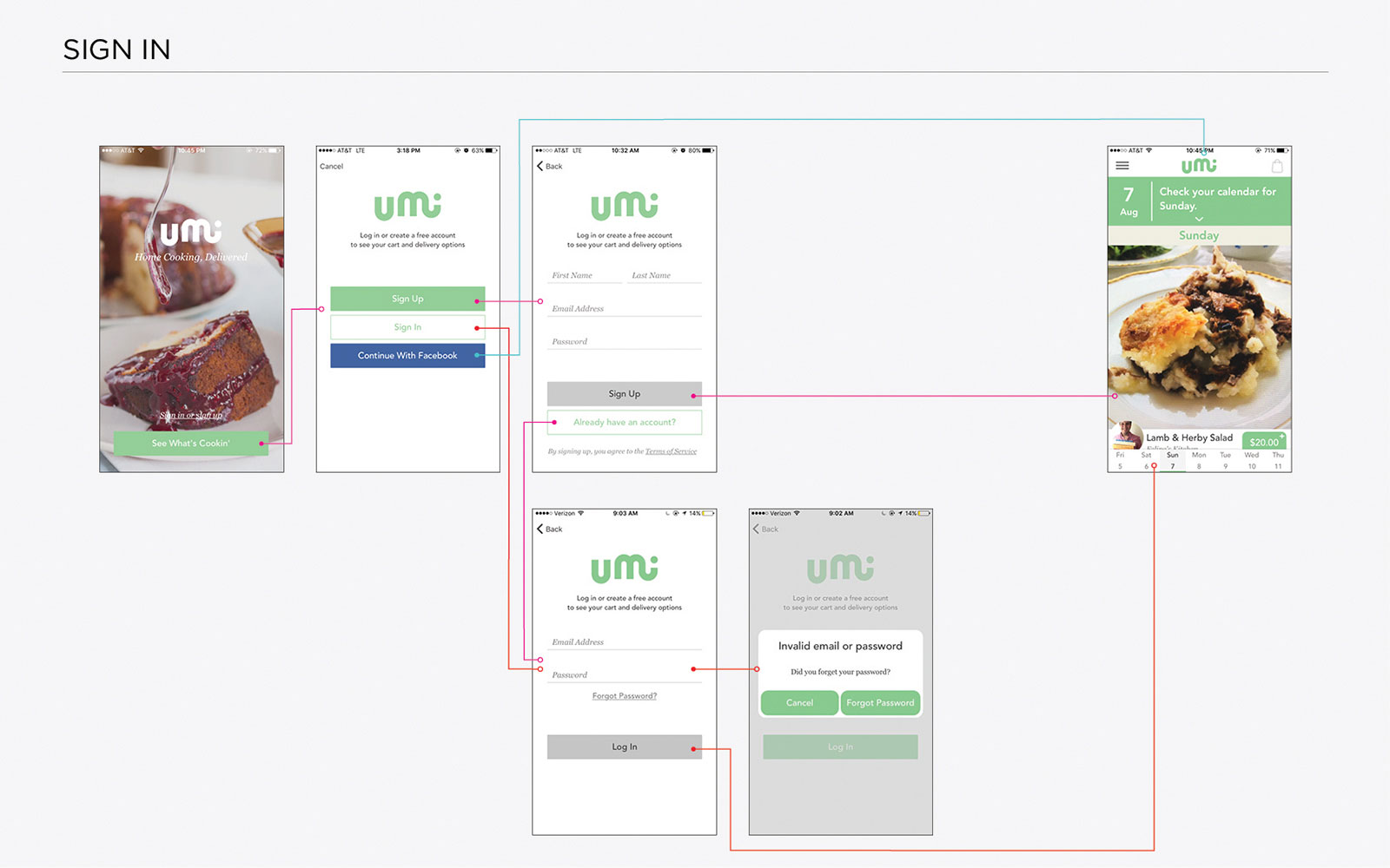
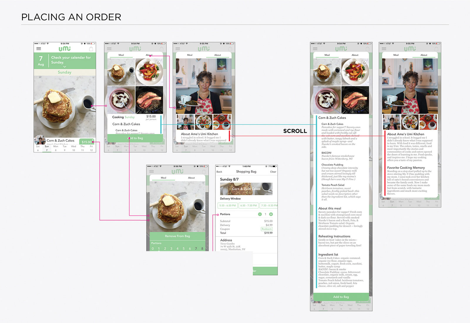
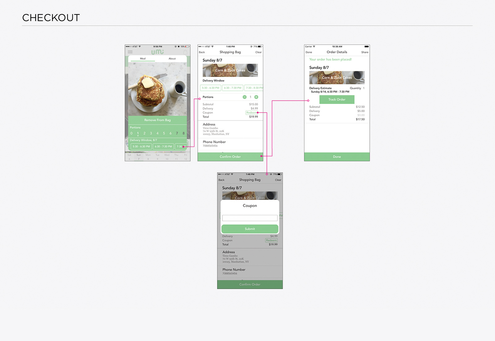
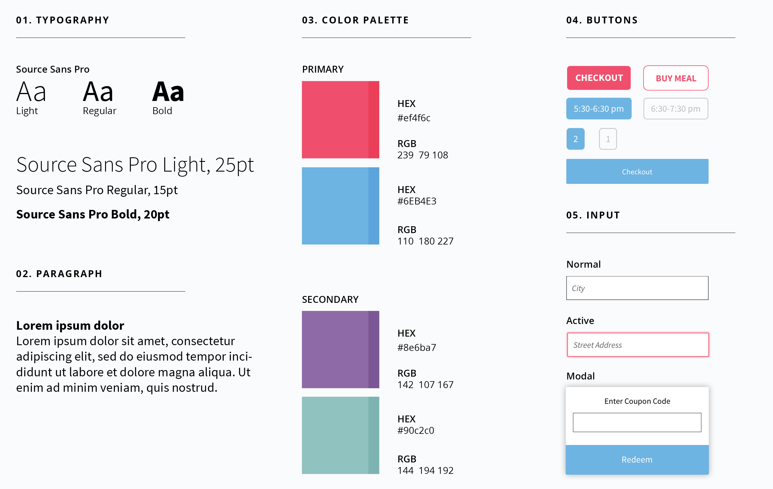
I wanted to understand the full scope of the current interface, so I took screenshots of the app and collected the current elements for navigation, colors, typography, forms, buttons, and interactive components. I found a minimal color palette, typography variations and inconsistent use of buttons.
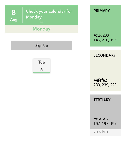
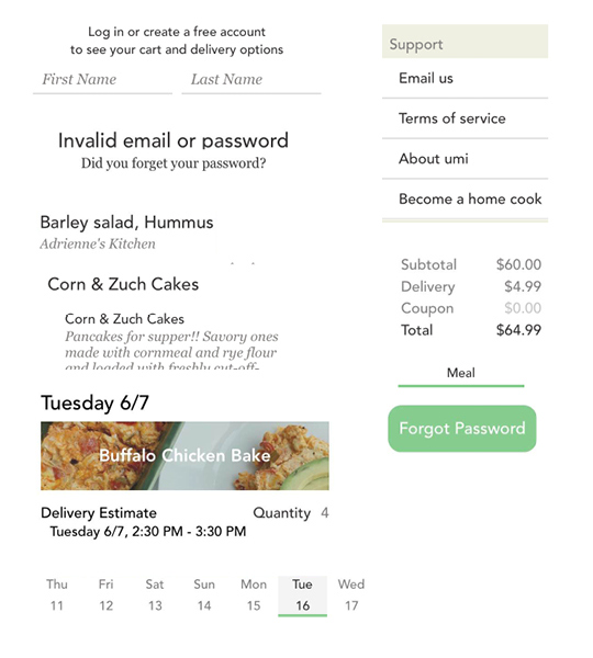
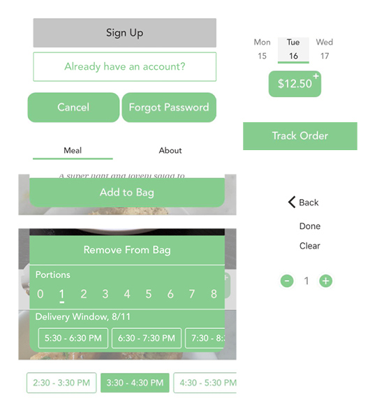
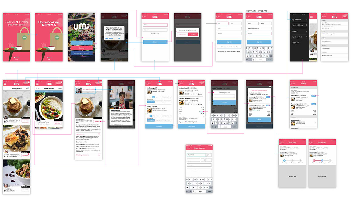
In addition to gathering UI elements, I also mapped out main usage scenarios then tested the user flows.
DEFINING GOALS
This phase was all about defining and developing a single design system that unifies the user experience throughout the app.
1. Expand color palette
2. Declutter screen distribution
3. Simplify typography
4. Establish a consistent design system
DEFINING GOALS
After an assessment, I arrived at the following goals for the UI refresh.
1. Expand color palette.
2. Re-evaluate screen space distribution.
3. Simplify typography.
4. Remove unnecessary modals.
THE REDESIGN
I wanted to establish a clear style guide for the brand.
TYPOGRAPHY. I thought original typefaces (Avenir and Chronicle Roman) didn’t pair well together. I switched the typeface to Source Sans Pro across the entire app. It has a higher x-height and lower stroke contrast for bulletproof typography.
COLOR. The original colors were quite muted. When I think of a home-cooked meal, I think of how rich the flavors are. I wanted the color palette to reflect that.
TYPOGRAPHY
I thought original typefaces (Avenir and Chronicle Roman) didn't pair well together. I switched the typeface to Source Sans Pro across the entire app. It has a higher x-height and lower stroke contrast for bulletproof typography.
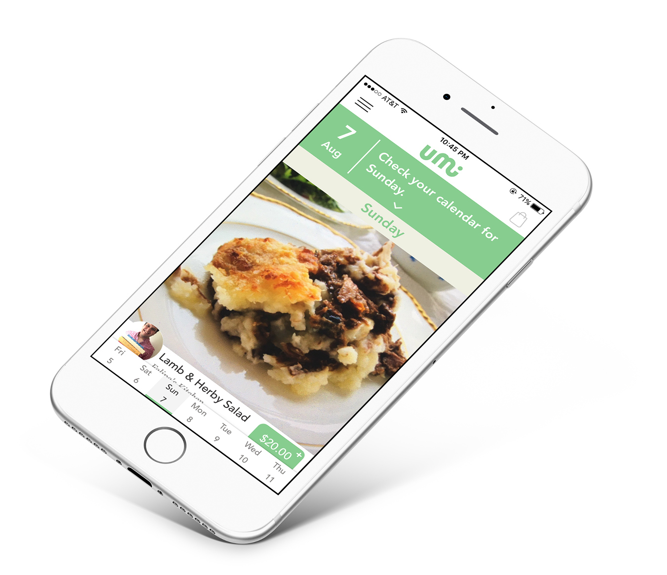
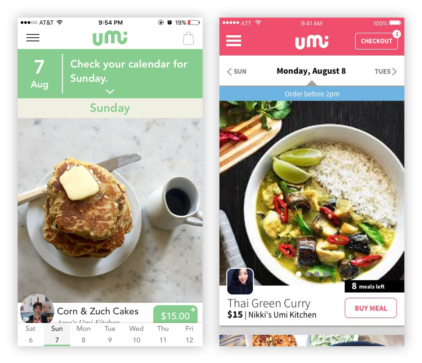
SCREEN SPACE. The main screen was cluttered with navigation. The distribution was 33% calendar/navigation and 67% for the main content. I increased screen space for content by 21%. In addition, the meals were presented as a long scroll, which is familiar to most users. I wanted to further delineate the meals from each other. I decided on a card layout to achieve this.
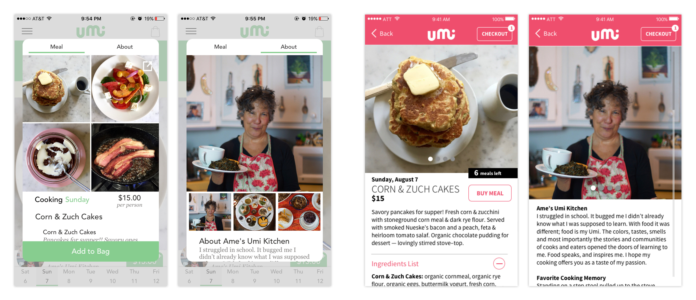
After clicking into a meal, a modal window appeared. I thought it merited it’s own screen instead. I reserved the use of modal windows specifically for errors and pop-up notifications. The team felt it was necessary to keep all of the meal information, but the scroll was too long. I introduced an accordion unit giving users control on which information they’d like to view.
After clicking into a meal, a modal window appeared. I thought it merited it’s own screen instead. I reserved the use of modal windows specifically for errors and pop-up notifications. The team felt it was necessary to keep all of the meal information, but the scroll was too long. I introduced an accordion unit giving users control on which information they’d like to view.
OUTCOME
I provided Umi Kitchen an updated design for them to launch in Manhattan. As a by-product of this experience, I tested my own UI process with a client and see results.
OUTCOME
I provided Umi Kitchen an updated design for them to launch in Manhattan. As a by-product of this experience, I tested my own UI process with a client and see results. I will continue to refine my design process so that I can deliver beautiful products every time.
BROWSE MORE PROJECTS
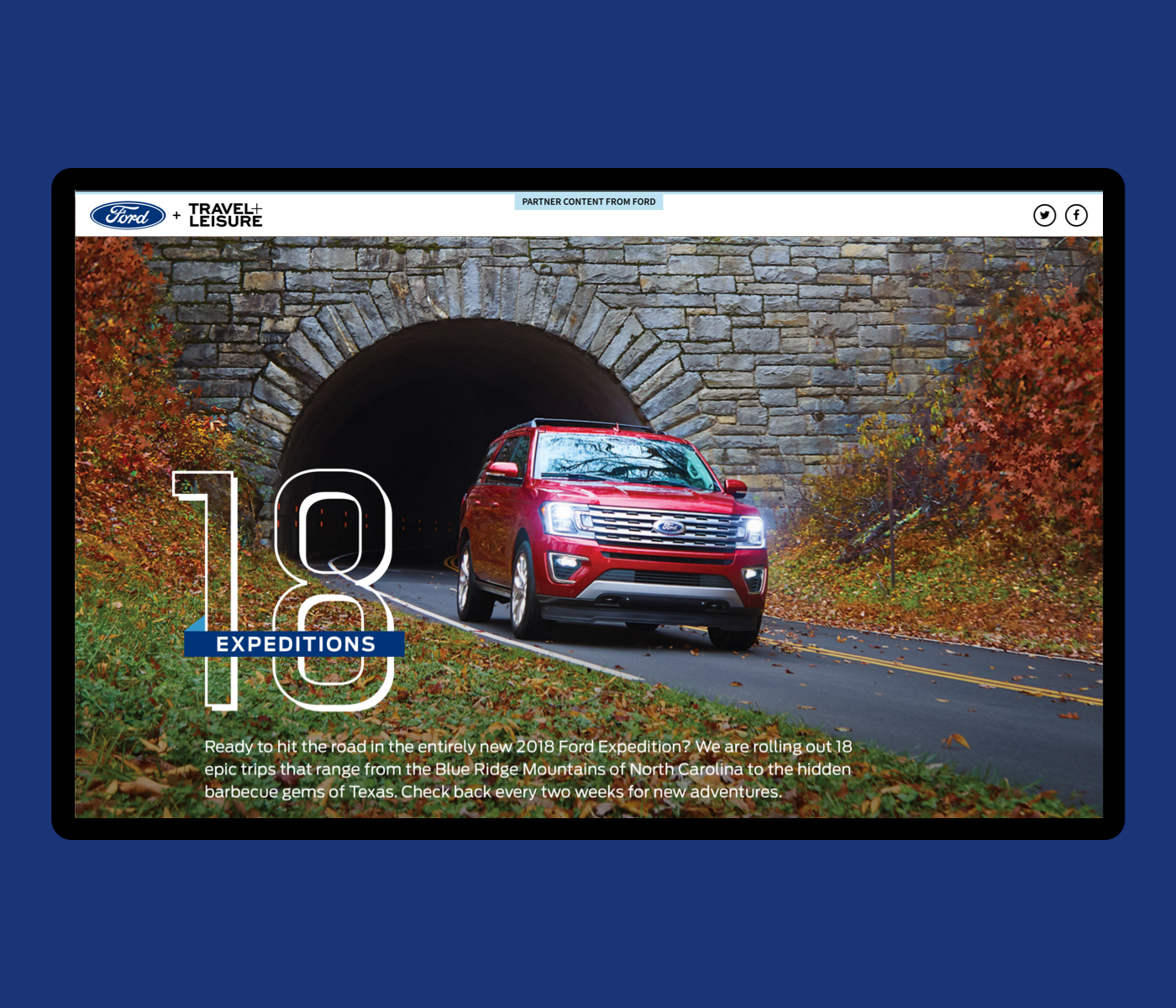
Ford 18 ExpeditionsCreative Direction & Design
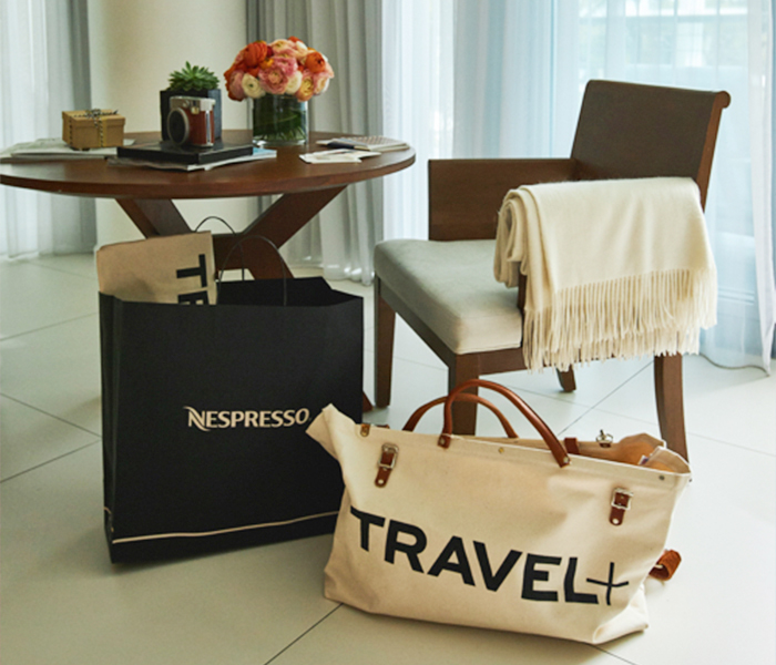
Nespresso at the Edition HotelCreative Direction & Design
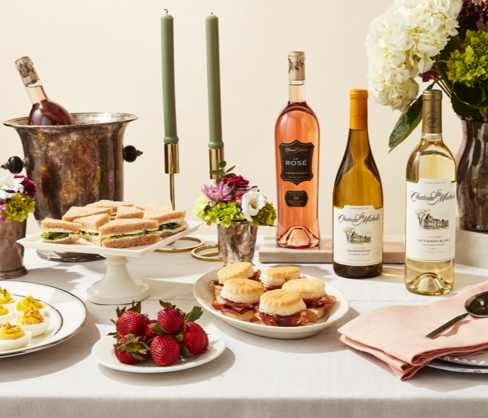
Chateau Ste. Michelle WinesCreative Direction & Design

Footwear News RedesignCreative Direction & Design

Porsche PanameraCreative Direction & Design
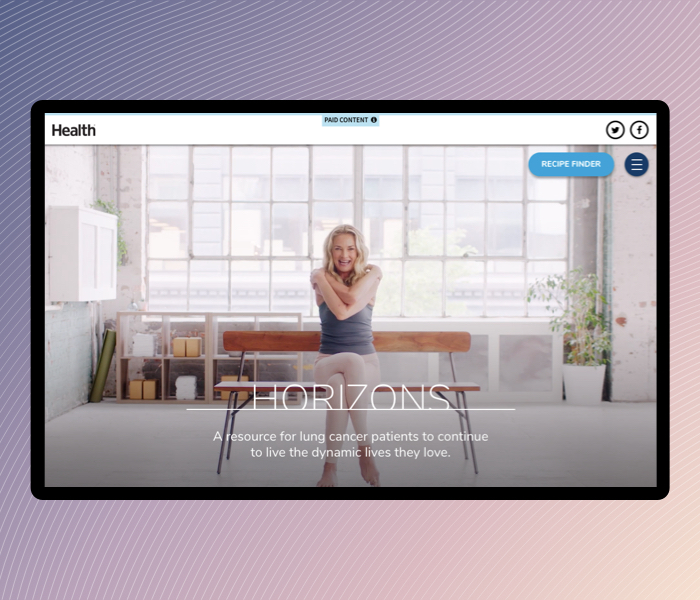
AstraZeneca HorizonsCreative Direction & Design

WWD DigitalCreative Direction & Design
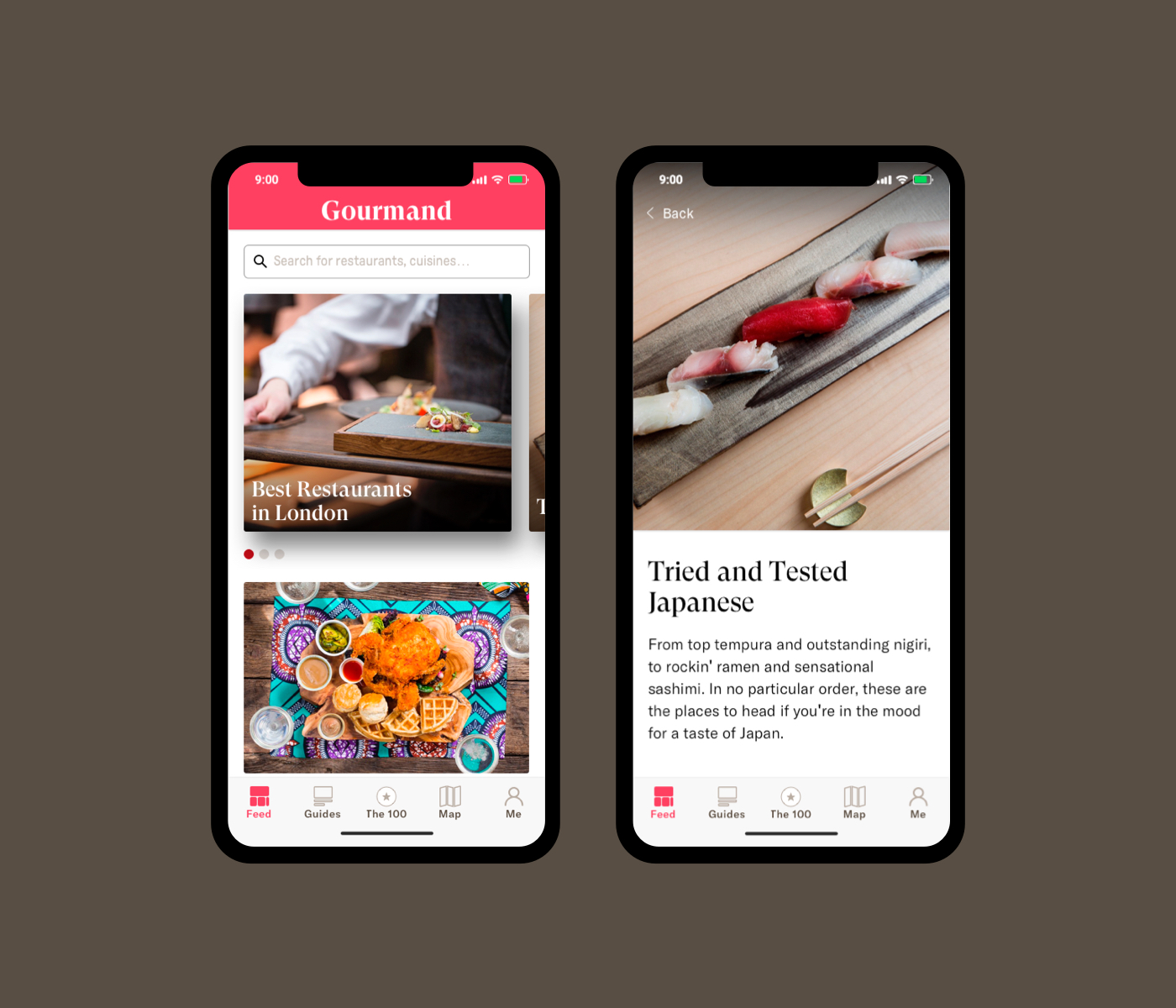
Gourmand AppUX Design
Umi Kitchen AppMobile App
StarbucksCreative Direction & Design
Walmart+ LaunchCreative Direction & Design
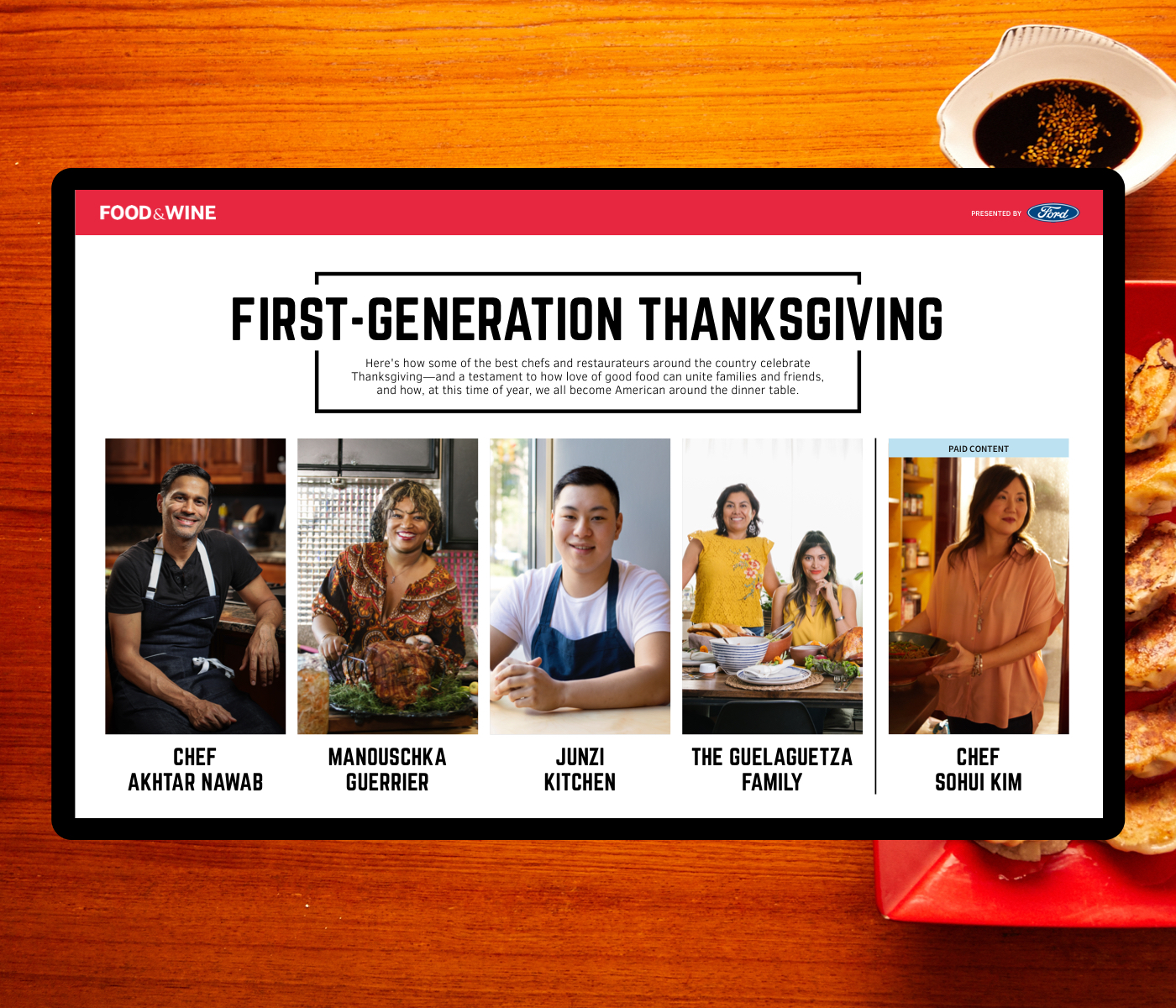
Miele Kitchens x Food & WineArt Direction & Design
Ford Empathy SuitsArt Direction & Design
Olay Why It WorksProject type
Tirso Gamboa © 2024 – All Rights Reserved